
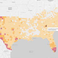


Foreign-Born Populations in the American South
This interactive visualization shows a representation of global connections throughout the American South. Using American Community Survey five-year estimates, the data considers the number of foreign-born residents in each county, and the countries of birth for those residents.
After pulling the data and preparing it for analysis in a spreadsheet, the visualization was developed through an exploratory process. By experimenting with combinations of variables in multiple chart types, a story began to emerge: pockets of foreign-born populations surrounding cities appear to be common, but the birth countries for those populations vary significantly.
To emphasize this trend and encourage audience interaction, the first dashboard uses a “story” format to highlight supporting examples. In addition, the views lead with a county map of the South, providing a familiar framework for the audience. The world map and associated views, color coded by region, allow audiences to see the birth countries of foreign-born residents in a given county.
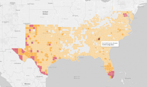
Click for interactive map
The information presented provides a single snapshot of the foreign-born population. The goal, then, is to encourage viewers to ask questions with a dynamic platform that allows them to explore possible answers. Additional insight may be gained by examining how these data change over time, how figures compared to other regions in the U.S., or case studies to explain why some places attract certain nationalities.