
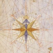
Detail from the 1375 Catalan Atlas, featuring a seminal compass rose
Share This


Print This
Email This
North As Up

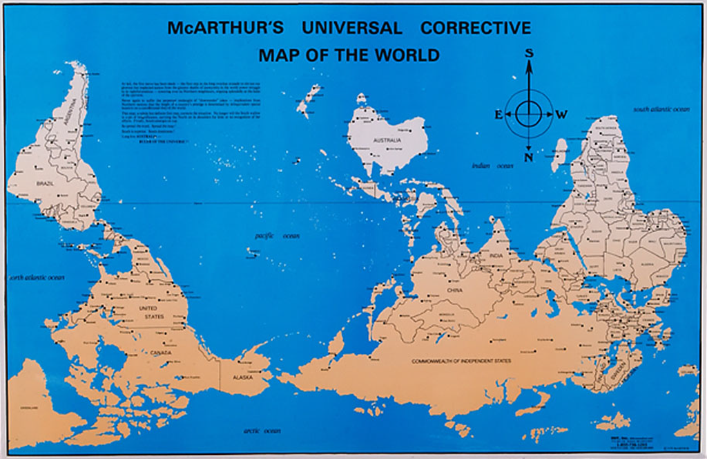
McArthur’s Universal Corrective Map of the World, first published in Australia, 1979.
Why do maps always show north as being up? It seems so obvious we hardly think about it anymore: “Because Europeans made the maps, of course, and they wanted to be on top.” We all probably accepted the profound arbitrariness of this cartographic convention when we first saw a map with everything flipped upside down titled “Australia: No Longer Down Under.” Our casual acceptance of white, Anglophone perspectives as global norms had been fundamentally challenged. All without ever stopping to wonder why the map wasn’t titled “Botswana: Back Where It Belongs” or perhaps “Paraguay Paramount!”
As is so often the case, our eagerness to invoke Eurocentrism displays a certain bias of its own, leading us to exaggerate the role that Europeans played in creating—or in this case, depicting—the world. In fact, the north’s elite cartographic status owes as much to Byzantine monks and Majorcan Jews as it does to any Englishman.
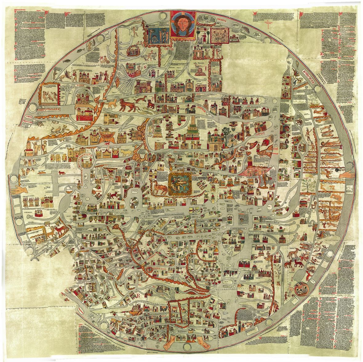
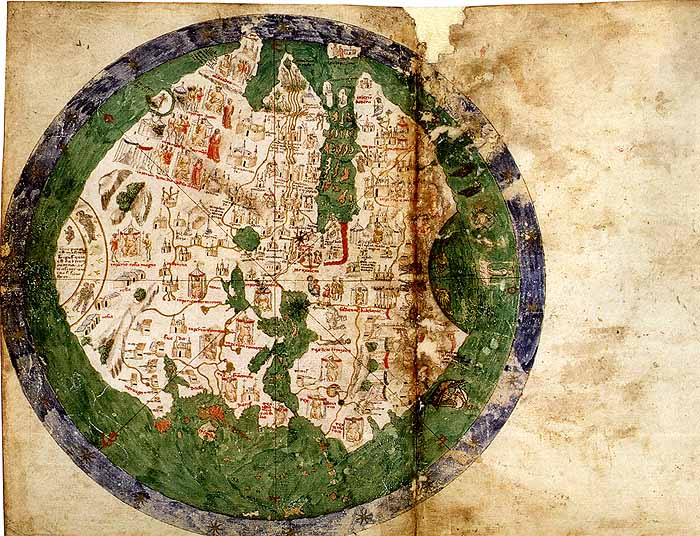
13th century Mappa Mundi or world map by Gervase of Ebstorf
There is, of course, nothing inevitable or intrinsically correct—not in geographic, cartographic, or even philosophical terms—about the north being represented as up, because up on a map is a human construction, not a natural one. Some of the very earliest Egyptian maps show the south as up, presumably equating the Nile’s northward flow with the force of gravity. And there was a long stretch in the medieval era when most European maps were drawn with the east on the top. If there was any doubt about this move’s religious significance, they illuminated it with their maps’ pious illustrations, whether of Adam and Eve or Christ enthroned. This east as up approach apparently explains not only where the word “orientation” comes from, but also quite possibly how we get “north” from an old Germanic word meaning left.
In the same period, Arab mapmakers often drew maps with south facing up. One theory is they did this because they thought right was preferable to left, but east was the most important direction, so they privileged south, the direction to your right if you’re facing east. Which makes a certain convoluted sense until you realize that this would make east left, undermining the initial left is bad logic. Another theory is they wanted to be on top of the Christians. (Which in itself takes for granted that they were more obsessed with besting European Christiandom than any of the other, potentially more advanced civilizations on the other sides of them.) Hence another popular theory, that the Muslims adopted south is up from the Chinese, along with the compass itself.
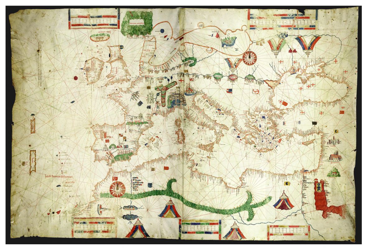
Things changed with the age of exploration. Like the Renaissance, this era didn’t start in Northern Europe. It began in the Mediterranean, somewhere between Europe and the Arab world. In the fourteenth and fifteenth centuries, increasingly precise navigational maps of the Mediterranean Sea and its many ports, called Portolan charts, appeared. They were designed for use by mariners navigating the sea’s trade routes with the help of a recently adopted technology, the compass. These maps had no real up or down—pictures and words faced in all sorts of directions, generally pointing inward from the edge of the map—but they all included a compass rose with north clearly distinguished from the other directions.
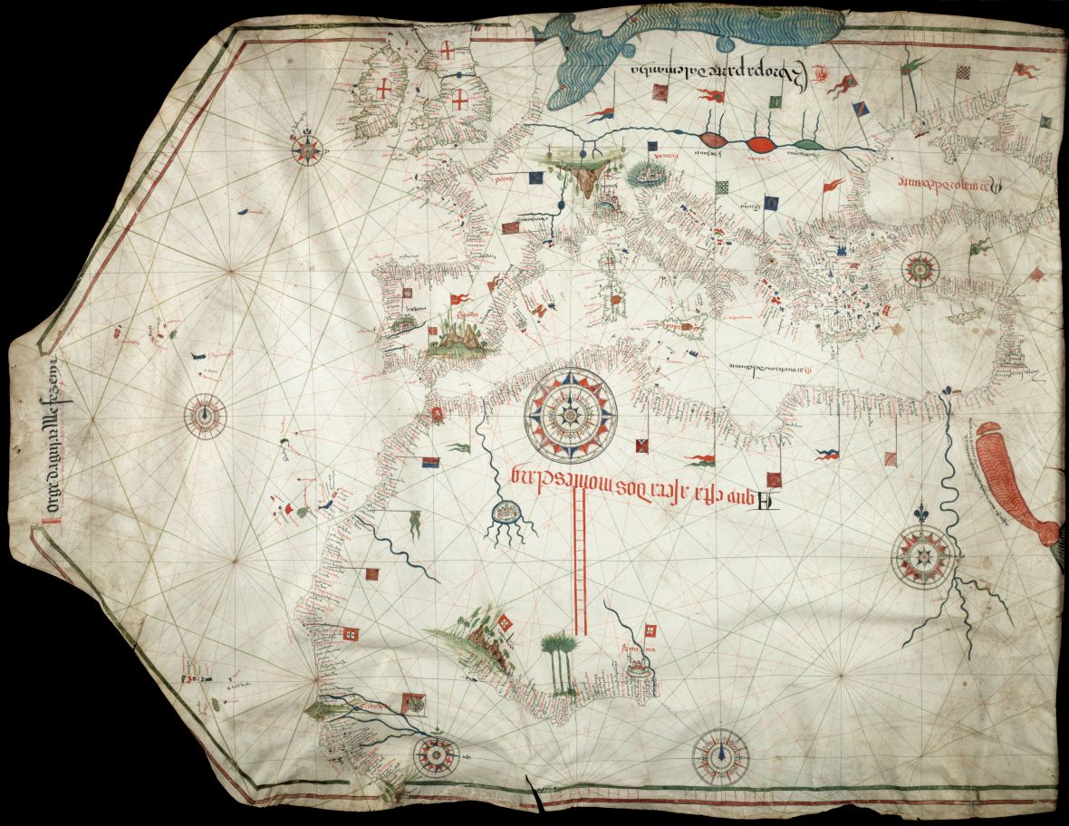
Portolan chart made by Portuguese cartographer Jorge de Aguiar in 1492
Portolan chart made by Genoese cartographer Albino de Canepa in 1489
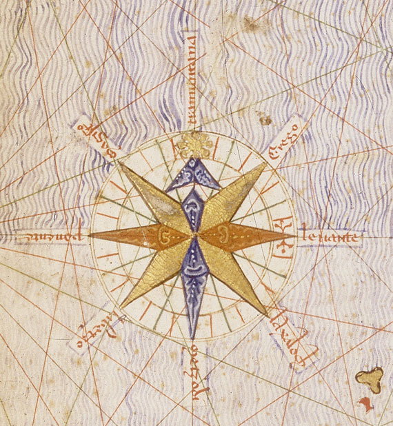
Detail from the 1375 Catalan Atlas, featuring a seminal compass rose
Members of the Italian Cartographic School preferred to mark north with a hat or embellished arrow, while their equally influential colleagues from the Spanish-ruled island of Majorca used an elaborate rendering of Polaris, the North Star. These men, who formed the Majorcan Cartographic School, also established a number of other crucial mapping conventions of the era, including coloring in the Red Sea bright red and drawing the Alps as a giant chicken foot. Among other hints of the school’s predominantly Jewish membership was the nickname of one of its more prominent members: “El jueu de les bruixoles,” or “the Compass Jew.”
.jpg)
But this is only part of the explanation. The arrow of the compass can just as easily point south, since the magnetized metal needle simply aligns with the earth’s magnetic field, with a pole at each end. Indeed, the Chinese supposedly referred to their first compass magnets as south-pointing stones. Crucially, the Chinese developed this convention before they began to use compasses for navigation at sea. By the time Europeans adopted the compass, though, they were already experienced in navigating with reference to the North Star, the one point in the heavens that remains fixed anywhere in the Northern Hemisphere. Many mariners saw the compass as an artificial replacement for the star on cloudy nights and even assumed it was the pull of the star itself that drew the needle north.
Yet even as this north-pointing compass became essential to navigation and navigational charts in the fifteenth century, maps from the period continue to offer a disorienting array of perspectives. Some had the east on top, in keeping with European tradition, while others preferred the south, in keeping with Arab tradition, and others went with the north, in keeping with the point on the compass rose.
1436 World Map by Italian Cartographer Andrea Bianco
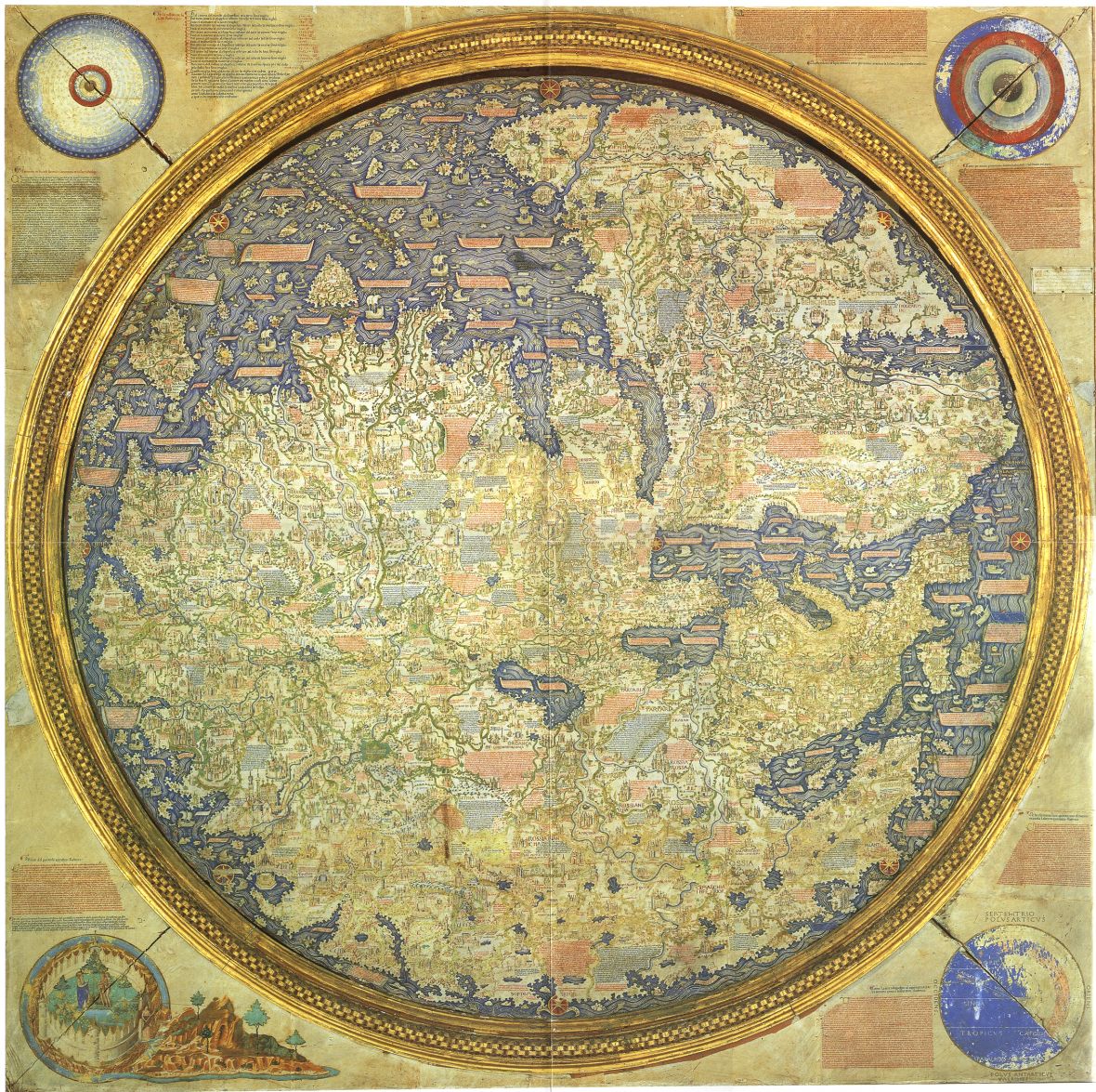
Mid-15th century world map by Italian cartographer Fra Mauro
More important, though, than who was on top during this period was the question of who was in the center. Among other things that stand out in these maps is that, given the extent of the known world, the location of the Mediterranean, and a bit of uncertainly about the equator, Italy remained more or less halfway between the top and bottom whichever way you turned the map. Conveniently, Italy was at roughly the same latitude as Jerusalem, which at the time mapmakers piously assumed was at the center of the known world.

Heinrich Bünting’s stylized 16th century “clover-leaf” map
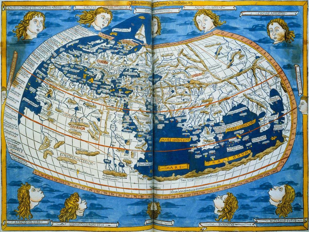
A 1482 map by Johannes Schnitzer based on Ptolemy’s geography
But while the compass rose had already given north a special place on maps, its position on top of the world would only be secured in the sixteenth century. This, it appears, was thanks in part to Ptolemy, another European discovery that, like the New World, others had known about for quite some time. Ptolemy was a Hellenic cartographer from Egypt whose work in the second century A.D. laid out a systematic approach to mapping the world, complete with intersecting lines of longitude and latitude on a half-eaten-doughnut-shaped projection that reflected the curvature of the Earth. The cartographers who made the first big, beautiful maps of the entire world, Old and New—men like Gerardus Mercator, Henricus Martellus Germanus, and Martin Waldseemuller—were obsessed with Ptolemy. They turned out copies of Ptolemy’s Geography on the newly invented printing press, put his portrait in the corners of their maps, and used his writings to fill in places they had never been, even as their own discoveries were revealing the limitations of his work.

Martin Waldseemuller’s 1507 map of the world, with Ptolemy featured on the top left-center
For reasons that remain unknown, Ptolemy put the north up. Or at least that’s the way it appears from the only remaining copies of his work, made by thirteenth-century Byzantine monks. Ptolemy knew that, sitting in Alexandria, he was in the northern half of a very large globe, whose size had been fairly accurately calculated by the ancient Greeks. Yet by putting north on top, he also put Alexandria down below what he would have understood as the main centers of the civilized world.
Even if compasses and Ptolemy had both pointed to the south, northerners could still have come along and flipped things around. In fact, with north seemingly settled at the top of the page in the sixteenth century, there were still some squabbles over who in the Northern Hemisphere would end up left, right, or center. Even here, though, the politics of orientation are not as simple as they might seem. For Americans, it’s easy to think that our position, at the top-left of most maps, is the intrinsically preferable one; it certainly seems that way if you happen to be from a culture that reads from left to right. But it’s unclear why Arabs or Israelis, who read from right to left, would necessarily think so. And while mapmakers usually like to design maps with the edges running through one of the world’s major oceans, it is certainly possible to put North America in the very center by splitting the world in half through Asia. As the United States was just beginning to emerge on the world stage in the nineteenth century, American cartographers made some earnest efforts to give the United States pride of place.

A Project For A Railroad To The Pacific. By Asa Whitney, of New York. With Reports of Committees of Congress, Resolutions of State Legislatures, Etc., with other Facts Relating Thereto. New York: Printed by George W. Wood, No. 15 Spruce Street. 1849.
While there is something endearing about the idea of an Indiana mapmaker in 1871 preparing an atlas with Indiana squarely in the center of the world, the unfortunate side effect was that most of the Midwest disappeared into the gaping crease between atlas pages. Nepal, of course, gets a bit cut off on the sides, but that is nothing compared with what happens to Nebraska.
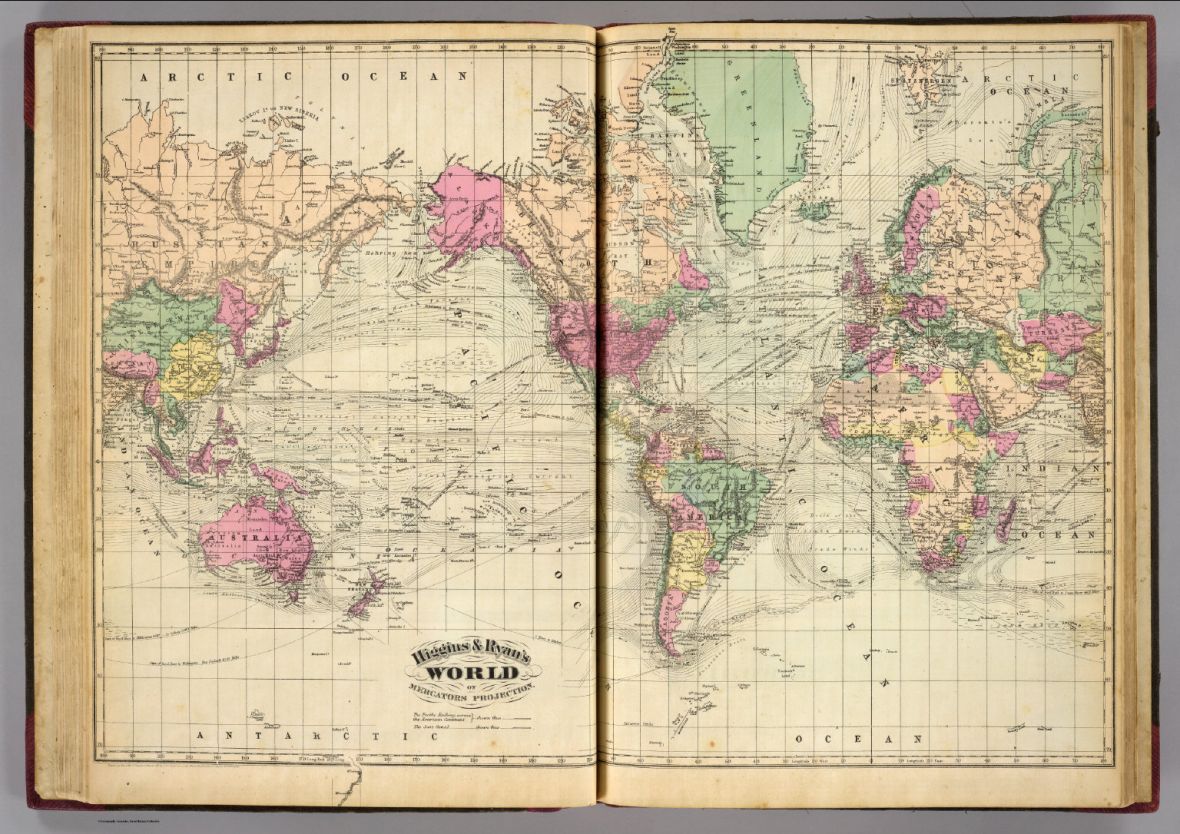
Higgins & Ryan’s World, Indianapolis, 1871
The orientation of our maps, like so many other features of the modern world, arose from the interplay of chance, technology, and politics in a way that defies our desire to impose easy or satisfying narratives. But at a time when the Global South continues to suffer more than its share of violence and poverty, let’s not dismiss McArthur’s Universal Corrective Map of the World too quickly. It continues to symbolize a noble wish: that we could overturn the unjust political and economic relationships in our world as easily as we can flip the maps on our walls.
References
Campbell, T. 1987. “Portolan Charts from the Late Thirteenth Century to 1500.” The History of Cartography. Vol. 1, 371–463. Chicago: University of Chicago Press.
Edson, Evelyn. 1998. Mapping Time and Space: How Medieval Mapmakers Viewed Their World. Toronto: University of Toronto Press.
Harley, J. B., and David Woodward, eds. 1987. The History of Cartography, Vols. 1 and 2: Cartography in Prehistoric, Ancient, and Medieval Europe and the Mediterranean. Chicago: University of Chicago Press.
Nordenskiöld, Adolf Erik. 1896. “Résumé of an Essay on the Early History of Charts and Sailing Directions.” Report of the Sixth International Geographical Congress: Held in London, 1895, 685–94. London: J. Murray.
Nordenskiöld, Adolf Erik. 1897. Periplus: An Essay on the Early History of Charts and Sailing Directions. Trans. Frances A. Bather. Stockholm: Norstedt.
Winter, Heinrich. 1958. “Catalan Portolan Maps and Their Place in the Total View of Cartographic Development.” Imago Mundi 1 (11): 1–12.
0 Comments
Trackbacks/Pingbacks